LinkedIn single image ads: turn a source asset into finished creative
A LinkedIn single image ad puts one image beside your introductory text, headline, and call to action. The image needs one clear job. It can show a product detail, make a resource recognizable, or put a specific promise in front of the right buyer.
Start with the thing you can show. Choose the claim it supports, remove visual distractions, and make that relationship readable at phone size. Then write the surrounding copy to explain the buyer’s situation and next action.
Below are three real ads, followed by a complete fictional product-ad redesign. You can open the source screen, compare the first and revised compositions, and download the editable files. If your artwork is already finished, go straight to the file-specification checker or LinkedIn feed mockup.
Choose a structure your source material can support
A product screen, a report cover, and a customer quotation give you different starting points. Choose the structure after looking at the material. A template with a large result number is the wrong starting point if you have no approved result.
Swipe to read all columns, or focus the table and use the arrow keys.
| Material you have | What the image can do | What to preserve |
|---|---|---|
| A product screen that shows a relevant action or state | Show the detail that explains the promise | Labels, values, and context needed to understand the state |
| A real guide, report, or checklist | Show what the reader will receive and make its topic readable | Actual title, cover identity, and what is included |
| An approved customer quotation or result | Let the customer's evidence carry the message | Exact meaning, attribution, permission, and necessary qualification |
| A supported product promise without a clear product visual | Give the promise visual priority | Specific buyer relevance; avoid decorating an unsupported claim |
The examples below show composition choices. Their public presence does not establish their performance. The artwork belongs to its respective advertiser; the editable exercise later in this guide uses original fictional material.
Snowflake: make one promise the largest thing
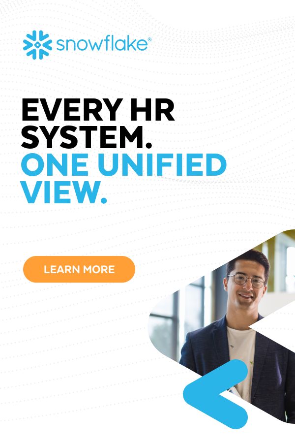
Snowflake's image reads “EVERY HR SYSTEM. ONE UNIFIED VIEW.” The words take most of the upper half. Blue highlights the promised unified view; an orange “LEARN MORE” shape provides the next action. The portrait occupies a curved area lower down, so the face does not compete with the main sentence.
The archived introductory copy explains the audience and context: Snowflake describes unifying HRIS, ATS, survey, and learning-and-development data for financial-services HR leaders. The captured headline is “One Workforce View, Not a Dozen,” and the platform CTA is Learn more. The destination was not retained, so its arrival experience is unverified.
What to adapt: give the central sentence more room than the supporting photograph. Use the introductory text to name the systems and buyer. A photograph can help the design feel human, but it does not prove that systems are connected. If your claim requires product evidence, show that evidence instead.
View Snowflake ad 1616356236 in LinkedIn's Ad Library.
Zoom: divide the idea and the explanation
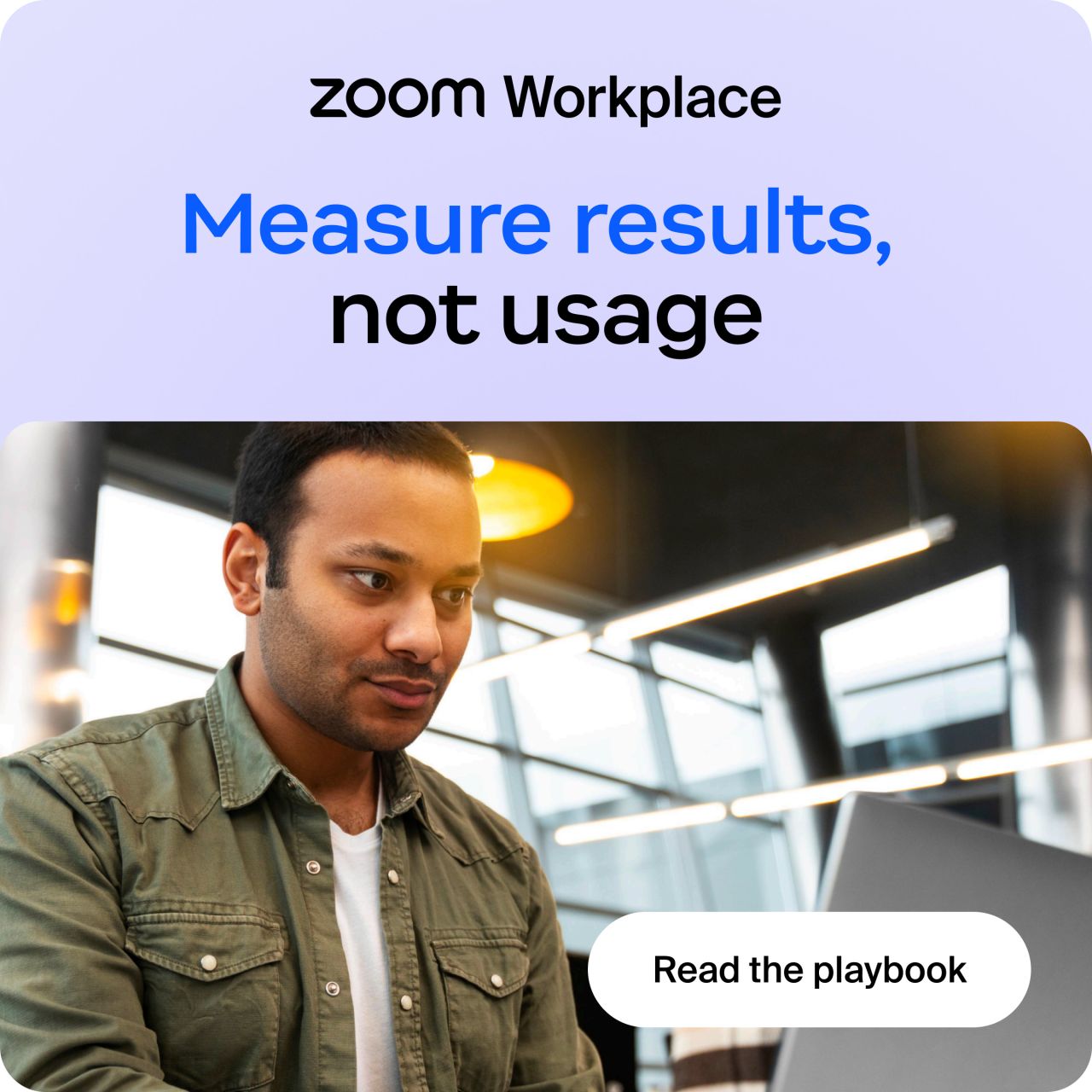
Zoom's square image leads with “Measure results, not usage.” The brand sits above it; the lower half shows a person at a laptop and a “Read the playbook” shape. The large text frames a decision without squeezing the whole argument into the image.
The captured intro asks how the reader knows whether collaboration tools are working. Its headline is “Shift your IT strategy from tracking usage to measuring outcomes.” The platform CTA is Download. The playbook destination was not retained, and we have not inspected its contents.
What to adapt: let the image introduce one decision, then use the intro to explain who faces it. Keep the resource action consistent across the image and platform CTA. Do not fill the image with a list of lessons you have not confirmed the resource contains.
View Zoom ad 1609041446 in LinkedIn's Ad Library.
Datadog: repeat the title outside the book cover

Datadog puts a three-dimensional book cover beside large text: “Cloud-Scale Monitoring with Azure and Datadog.” The cover identifies the resource. The separate title makes the subject readable without asking someone to decipher the smaller lettering on the cover.
The captured headline is “Datadog eBook: Migrate, Monitor, and Scale Any Azure Workload.” The platform CTA is Learn more, leading to the Azure ebook resource URL. The archived destination identifies the resource route; its current headline, access requirements, and download flow are unverified here.
What to adapt: use the real cover, then set its topic in larger type beside it. This keeps the topic readable when the cover contains fine detail. Keep the text faithful to what the resource actually covers. Check the resource itself before borrowing claims about what readers will learn.
View Datadog ad 1607725996 in LinkedIn's Ad Library. For more creative approaches across channels, see the B2B ad examples.
Start with the facts the image is allowed to show
Before opening a design template, write down the buyer, the situation, the one claim, the source that supports it, and the next action. Keep the original source beside your working file. This makes it easier to spot a crop or rewrite that changes the meaning.
For a product screenshot, confirm that the screen shows the feature or state you plan to describe. Remove private records before creating public artwork. For a testimonial, retain the attribution and the approved wording. For a result, preserve the period, population, and qualification that make the number accurate. If that context cannot fit legibly, choose a different claim or format.
Our exercise uses FieldLedger, an invented product. Its source screen shows an account with an owner, a “Next step missing” state, and an “Add next step” control. The brand, interface, account, and person are fictional. There is no real customer result or live landing page.
The exercise's buyer is a sales manager reviewing account handoffs. The image's job is to make the missing next step obvious. The proposed next action is to see the handoff workflow. That is enough to build a composition without inventing a revenue claim.
Build the image, then revise what competes with the message
Begin with the complete source screen
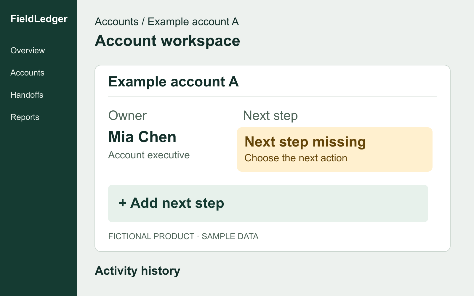
The source is a 1600 × 1000 drawing with a navigation sidebar, page heading, account card, and activity-history heading. The account card contains the detail we need: an owner exists, but the next step is missing.
Keep this original intact. The revised artwork will use a crop of this same drawing. It will not retype the account card, replace the state, or remove the fictional-data label.
The first composition asks the reader to choose the point
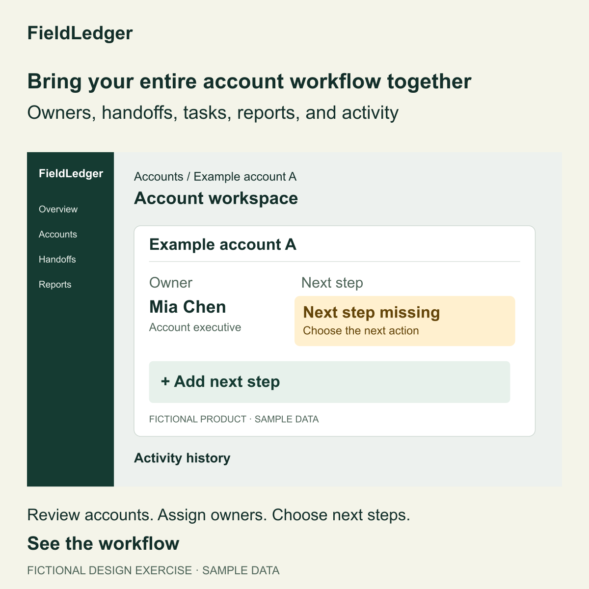
The first image says “Bring your entire account workflow together,” then lists owners, handoffs, tasks, reports, and activity. It includes the full interface. The buyer can see the product, but has to decide which part matters.
At a small displayed size, the sidebar, page title, and feature list take space away from the account state. The main sentence is also broad enough to fit many tools. This first version is deliberately less focused; it is a design exercise, not a losing ad from a real campaign.
Crop around the evidence and enlarge the message
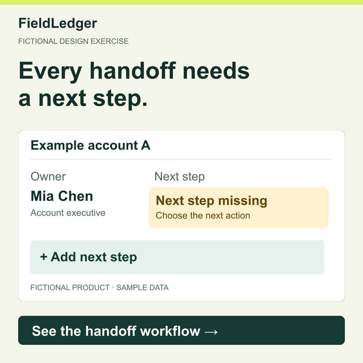
The revised image says “Every handoff needs a next step.” The card directly underneath shows an owner and the missing next step. The reader can connect the sentence to the pictured problem.
The crop removes navigation and activity history. It keeps the entire account card, including its qualification. On the 1600 × 1000 source, the crop begins at x=320, y=220 and measures 1200 × 630. On the square ad, it sits at x=60, y=430 and measures 1080 × 567. Both dimensions scale by 0.9, so the interface is not stretched.
The revised SVG embeds the unchanged source drawing. If you compare the source with the finished image, “Next step missing,” the owner, and the fictional-data label remain the same. In your own work, keep the same discipline: crop irrelevant navigation, but retain any date, status, filter, or qualification that changes the claim.
The lower action band says “See the handoff workflow.” It is part of the image, not a separate clickable control. It repeats the action the surrounding ad copy will ask the viewer to take.
Give each element a place in the reading order
The main sentence comes first, the product detail explains it, and the action follows. The brand remains visible without competing with the sentence.
Swipe to read all columns, or focus the table and use the arrow keys.
| Element | This design's choice | Reason |
|---|---|---|
| Canvas | 1200 × 1200 square | A documented LinkedIn recommendation that supports desktop and mobile |
| Main sentence | Two lines, 78 px in the source artwork | Keeps the single idea prominent at a smaller display size |
| Product card | 1080 × 567, cropped from the unchanged source | Gives the relevant state more room than the surrounding interface |
| Background and text | Pale background with dark green text | Makes the sentence and card boundaries easy to distinguish |
| Action | One dark band below the card | Leaves a clear next step after the explanation |
These positions and font sizes fit this example. A longer sentence or a different screenshot needs a new layout. Shorten the sentence or move elements before reducing all the type.
Make the surrounding copy finish the same thought
The image does not need to hold every sentence. Use the intro to identify the problem, the artwork to make it visible, and the headline and CTA to make the next action clear.
For the fictional exercise, the complete copy is:
- Intro: Your account has an owner. Does it have a next step? See the handoff workflow in FieldLedger.
- Image: Every handoff needs a next step. The pictured account card shows the missing state.
- Headline: See the account handoff workflow
- Platform CTA: Learn more
- Destination: No live destination exists for this exercise. An actual ad needs a page that shows the promised workflow.
The intro asks a specific question. The image makes the gap visible. The headline and CTA lead to the same action. None of these elements promises faster sales, extra pipeline, or a measured improvement.
For your own ad, open the destination and compare its first visible promise and action with the creative. If the ad says “Download the checklist” but the page asks for a sales call, fix that mismatch before treating the creative as ready for review.
Check the exported image at phone size
Open the actual PNG at about 360 pixels wide without zooming. Ask someone to name the message, point to the supporting detail, and identify the next action. If they need to enlarge the image to understand the central point, revise the composition.
Both images use the same display width, up to 360 pixels. Open the first PNG or open the revised PNG at full size.
In this exercise, the same source label has more space in the revised artwork because the sidebar and page header are gone. The headline is also larger. Compare both images at the same displayed width; comparing a large final image with a tiny first draft would hide the real tradeoff.
Inspect the exported file as well as the editable source. Fonts can substitute during export, text can clip, and a screenshot can become soft after resizing. Keep essential qualifications readable. A large claim with an illegible qualification is still a problem even if the file meets the platform's dimensions.
Check contrast in the image itself. Switching this article between light and dark themes does not change the pixels of the ad. For a longer headline, try a shorter supported sentence or a different composition before reducing every label.
Download the editable exercise and make your own variant
Download the artwork kit. It includes the source screen, first composition, revised composition, SVG and PNG files, the source-facts record, and instructions. The third-party reference ads are not included in this kit.
Open review.html to compare the example files. Open revised-square.svg in a vector editor to change the artwork. The SVG contains editable text and shapes; it is not a LinkedIn upload file. Export a PNG or JPG after editing, then inspect the exported image again.
The kit also includes a reproducible Python generator. Run python3 generate.py to rebuild the example SVGs. Its optional PNG exporter uses an existing librsvg installation. It does not install software. You can instead export from your design application at the document dimensions. Editing the generator is optional; direct SVG changes will be overwritten if you regenerate, so save your adaptation separately.
To make a different variant, change the buyer question while keeping the source truthful. For example, focus on the owner's next action with “Who owns the next step?” Retain the visible missing state and avoid implying that the screenshot shows a completed task. Review the new headline and crop together. The supplied positions are a starting point, not an automatic layout system for any text.
Use the review prompt below with your artwork and source facts. It asks for concrete repairs and separates visual review from facts that still need an owner or platform check. It cannot inspect pixels you do not attach.
Review your artwork with the source beside it
Copy this prompt into your AI tool. Attach your original source image, exported artwork, exact copy, and claim or permission notes. Open the plain-text prompt to select it directly.
Read or select the full prompt
Finish with file validation and a feed review
LinkedIn's single-image specifications recommend a 1200 × 1200 square image for desktop and mobile. The published file guidance lists JPG, PNG, or GIF and 5 MB. This exercise uses PNG. LinkedIn's recommended headline and introductory-text lengths are 70 and 150 characters respectively; recommendations are not the same as maximum limits. Check the current specs guide for the detailed rules and actual-file checker.
Place your finished artwork and exact copy into the LinkedIn ad mockup. Review the complete ad, including the company identity, image, headline, CTA, and destination. Check the final ad in Campaign Manager before launch; file validation and an approximate mockup cover only part of that review.
When testing a revision, name what changed and what you expect it to improve. Keep the audience, offer, and measurement plan clear so you can interpret the result. See the LinkedIn A/B testing guide for designing that comparison. Do not assume that the revised exercise above would win a real campaign.
If the ad's message, offer, and destination need a second look, get a Demand Gen Roast.
Common single-image design questions
Should the image contain a button?
It can contain a visible action, as the Snowflake and Zoom examples do. That shape is part of the artwork. It is not an extra interactive button. Use it when it clarifies the next step without crowding out the message, and keep its action consistent with the platform CTA.
Should I show the entire product screen?
Show enough context to make the detail truthful. A complete screen can help when navigation or relationships between panels are the point. For one account state, a tighter crop often makes the explanation easier to read. Do not remove the filter, date, or qualification that makes a number accurate.
Can I use a customer quote instead of a screenshot?
Yes, when you have the approved quotation, attribution, and permission to use it. Preserve the meaning and any qualification. If you have only an unsupported sentence in a design template, use a different structure until the evidence is available.
Is square always better than landscape?
No. Square gives this worked product card enough vertical room and supports desktop and mobile under the documented recommendation. Landscape can fit a wide comparison. Choose the canvas for the material and intended placement, then review the actual result. The existence of one successful-looking example does not prove a universally better ratio.